FIDEM 2018
For this assignment, the topic is to develop concept ideas for “FIDEM” XXXV Canada 2018” with the theme of Women” and Women in Natural Sciences that celebrates the achievements & contributions they have made. For the concept ideas, a wordmark for” FIDEM” XXXV Canada 2018” needs a design and imagery that relates to the theme.
Ideation
Wordmark Concepts

Brochure

FIDEM Catalogue

Rationale
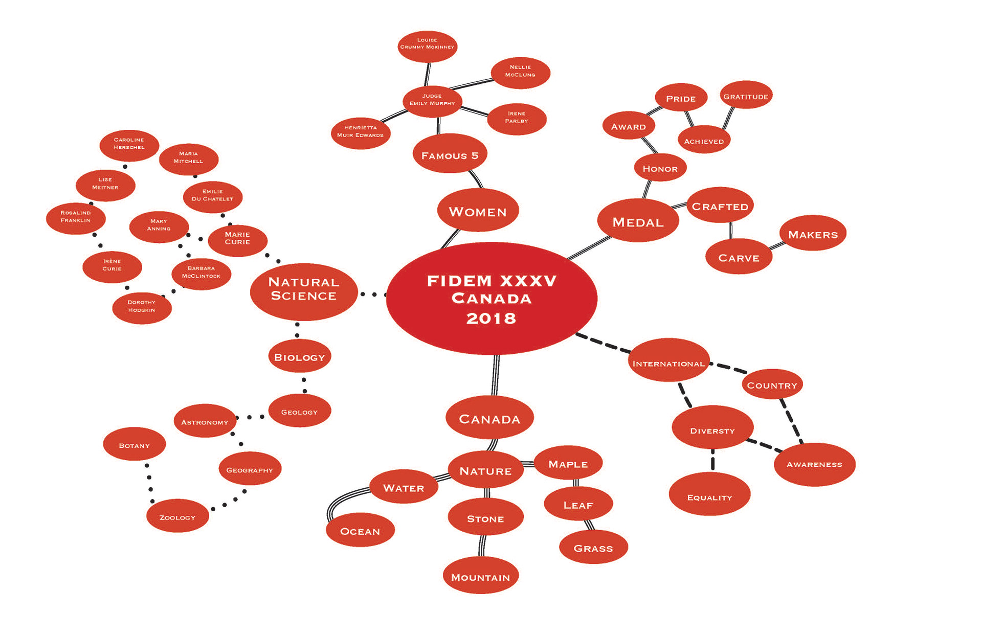
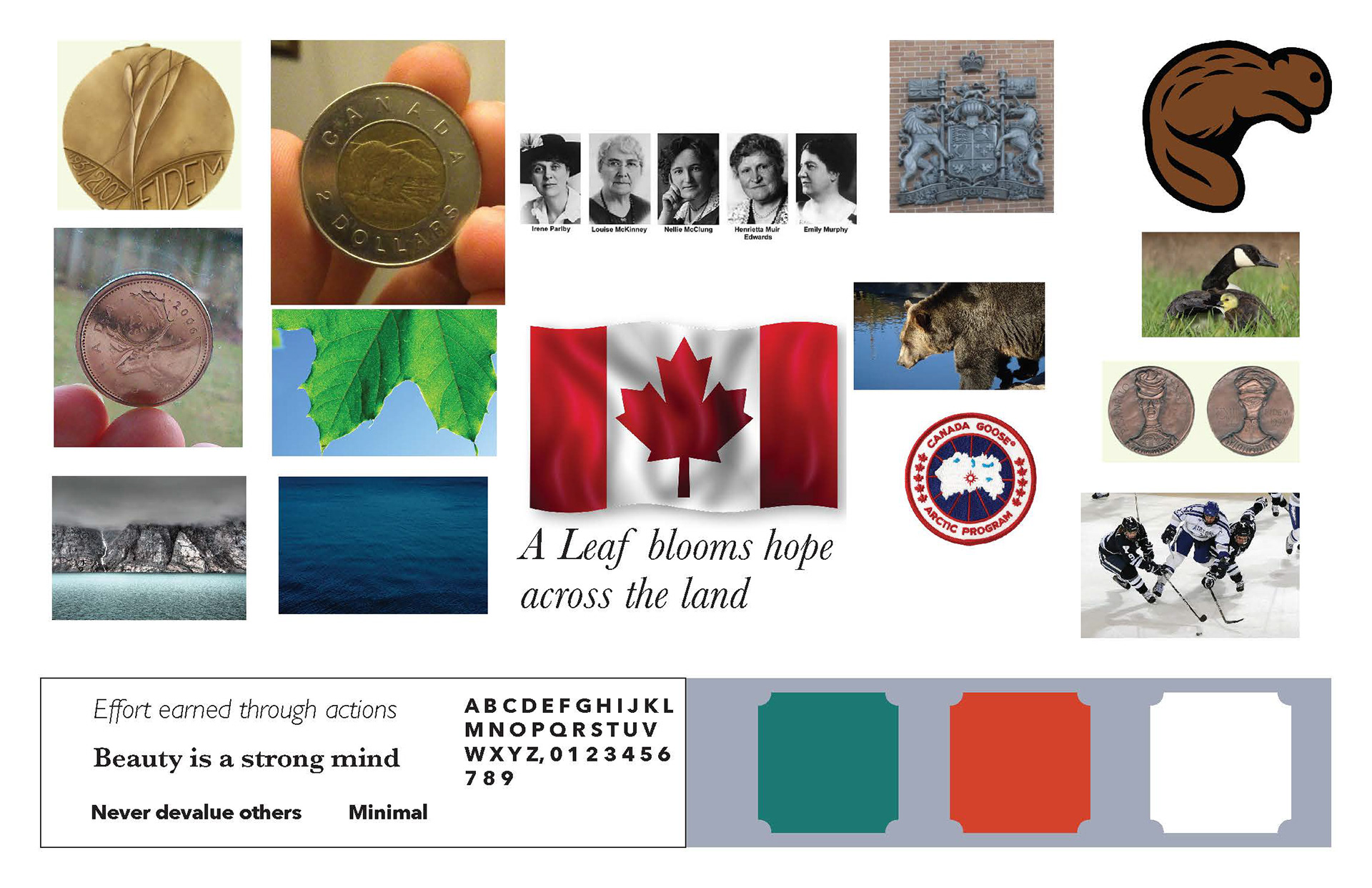
The theme for this imagery is to represent bold and pride that feels modern. It signify s pride because the leaf stands tall with no shame that represents that women not just make the achievements, but are proud of them to show what they have done to prove themselves, but also learning to respect themselves. It seems that the top of the parliament building with the clock tower roof with the leaf that feels bold showing that no matter how difficult it is, they endure and never give up to get to the point. It feels modern that feels up to date with the present that shows the work can stand strong without too much detail needed to convey the theme. Now, that the theme has been addressed, now to figure out how it will target the audience.
This concept will engage the target audience because it is a simple design, but effective without it being too extreme. The Leaf is pretty eye catching when you first notice it making it the focal point of what country it is from and that would be the Canadian maple leaf. The idea is a bit illustrative in a simplified form with less details to show that it is on top of a building. It flows from the bottom, to the top clock tower roof, as if it were growing like a tree, but in a maple leaf shape. The concept image has been discussed, type ideas are needed in this work.
The type choices are helpful for expressing the idea because as mentioned before that makes Canada feel modern enough that it is in our present time with the use of sans serif. Gill Sans is used for the wordmark “FIDEM” with a bold style to emphasis and gain attention. The use of two fonts to give them contrast in the style & size to distinguish what to read first and I decided that “FIDEM” is the first importance, second “Canada” with the “Arsenal” that is a serif font, having a leaf pattern in the C to make it more appealing, XXXV between the two words, and 2018 smaller pt size with an italic beside them to the right. Once the type choices had been selected, it was time to find out what my color palette would be for the concepts.
The colour palette expresses the nationality of Canada to help Canadians or newcomers to know what the country represents. The red is the first main color that always comes to mind when you think of Canada because of the maple leaf in the Canadian flag that may feel a bit cliche, but thats why I thought of doing a red—orange color to make it not exact just to have a different contrast to it. The 2nd chose in color in mind is a blue—green color that represents not just nature that Canadians are greatly represented in, but also because of the ocean and the mountains. The 3rd option is a light gray, because its neutral, and Canada has a bit of balance based on how peaceful and maintained the country is. These are the colours we have here, now to figure out the style of the imagery.
The style of the imagery expresses this concept because it feels organic that represents that Canadians & women worked hard in their efforts to get this far. The styling is a bit expressive not just because of the lines, but because it looks classic and a bit abstract. The layout design choices made to express the concept are simple, yet structured to maintain balance with the building & wordmark. The concept does feel modern because it is taken from a graphic design approach to keep it to somewhat of a minimalistic idea.